ODDWARE Brand guidelines / progress review / 2026
01 / 17
Progress review · November 2026 Prepared for PIC review

Not your usual gadget store.

01 Logo 02 Colour 03 Type
Scroll

00 · Progress review

Three decisions,
ready for review.

This deck summarizes the brand direction and presents three logo routes. Colour and typography are recommended; the logo is the open decision.

01 · LogoDecision needed

Three routes ready

Combination, logotype, and logomark. One will be selected for launch.

Options 01–03
02 · ColourRecommended

Cyber Industrial

Near-black, off-white, and one acid accent. Pending final sign-off.

Palette A
03 · TypeRecommended

Oxanium + IBM Plex Sans

Industrial display type with a clear, technical body face.

Pair A

Review outcome: confirm the colour and type direction, then choose one of the three logo routes. The selected logo will move to final vector refinement and application mockups.

00 · Context

A curated store
for uncommon tech.

ODDWARE is an e-commerce concept for experimental gadgets, unusual devices, and functional objects that are hard to find in mainstream electronics stores.

The brief

Sell gadgets with unconventional design and real function. Curate, explain, and support the product — do not behave like a generic marketplace.

Audience

Tech enthusiasts, makers and DIY buyers, developers and digital creators, and collectors who want products with a point of view.

Visual direction

Industrial calm. Simple, elegant, modern. Near-black, off-white, one acid accent, and product photography that shows the details.

Scope of this review: logo system, colour, and typography. Storefront, packaging, and social applications follow after the logo decision.

01 · Option 01

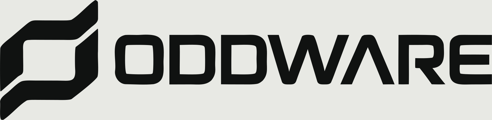
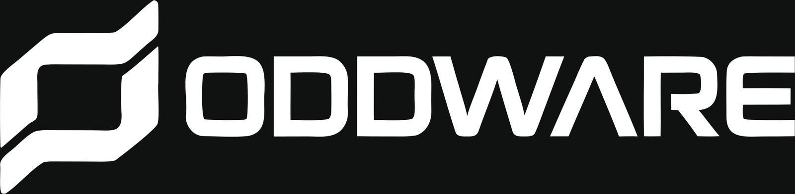
ODDWARE —
Combination

ODDWARE combination

Combination · mark + wordmark

A rounded modular mark paired with a wide, custom uppercase wordmark. The mark acts as the icon; the wordmark carries the name.

Why it works

It is the only route that delivers a complete brand signature in one asset. The mark is distinctive at small sizes, and the wordmark explains the name without extra copy.

Best used for

Storefront header, packaging, invoices, social profiles, and the app icon.

Considerations

The wordmark needs generous space. The mark is bold and can dominate small UI. The name still needs a trademark and domain check.

Choose this if

You want a launch-ready identity that works across e-commerce and packaging without commissioning another asset.

Brand clarity 5/5 Scalability 4/5 Production 3/5

Status: ready for review · final vector polish pending

01 · Option 02

MODULR —
Logotype

MODULR logotype

Logotype · wordmark only

A wide uppercase wordmark with a modular, technical rhythm. There is no separate mark; the wordmark is the identity.

Why it works

It is quiet, confident, and highly scalable. The name feels more abstract and design-led, and the wordmark works well in editorial layouts and large-format graphics.

Best used for

A name-led brand, apparel, editorial, and environments where the wordmark is enough.

Considerations

It needs a separate icon for favicon and app use. The name is less descriptive than ODDWARE, and it is not a complete lockup yet.

Choose this if

You prefer a name-led identity and are comfortable commissioning a companion icon.

Brand clarity 3/5 Scalability 5/5 Production 2/5

Status: concept ready · companion icon needed

01 · Option 03

Modular mark —
Logomark

Modular logomark

Logomark · icon only

A bold rounded-square mark with two cutouts. There is no wordmark; the mark is designed to work as a compact signature.

Why it works

It is the strongest route at small sizes. It reads instantly as an app icon, favicon, packaging stamp, or social avatar, and it holds up in one colour.

Best used for

An icon-first brand, packaging seals, merchandise, and digital product icons.

Considerations

It does not explain the brand on its own. It needs a wordmark for the storefront and formal documents, and it is less flexible for long-form communication.

Choose this if

You want an icon-first identity and will pair it with a separate wordmark.

Brand clarity 2/5 Scalability 5/5 Production 4/5

Status: icon ready · wordmark pairing needed

01 · Decision

Which route
should we take?

The options are not equal in scope. Option 01 is a complete system; Option 02 is a name-led wordmark; Option 03 is an icon that needs a wordmark partner.

Criteria 01 · ODDWARE 02 · MODULR 03 · Modular mark
Brand clarityHighMediumLow alone
WordmarkBuilt inBuilt inNeeds pairing
Icon / faviconBuilt inNeeds iconBuilt in
PackagingStrongStrongStamp only
Name flexibilityMediumHighLow
Production effortMediumLowLow
Recommendation

Option 01 is the safest launch choice: it is the only complete system and it fits the storefront and packaging use case. Option 02 is the strongest name-led alternative. Option 03 should become the icon system if the name changes.

Decision needed: choose 01, 02, or 03.

01 · Construction

Built on a simple grid.

Modular mark construction

Clear space & minimum size

Clear space
x · clear space1 module on every side
Mark minimum20 px
App icon16 / 32 / 64 / 128 / 512

Sizes & app icon

Mark 16px16
Mark 24px24
Mark 48px48
App icon

The mark sits inside a 6×6 area of an 8×8 grid. In the app icon it occupies 56–62% of the tile. If Option 02 is selected, a companion icon will be built on the same grid.

01 · In context

How the identity behaves.

The logo family is prepared for paper, ink, and acid fields. Use the supplied versions; do not recolour the mark by hand.

Ink / Reverse ODDWARE on Ink Primary on dark
Paper / Primary ODDWARE on Paper Default lockup
Acid / Icon Modular mark on Acid App icon / stamp
Ink / Mark Modular mark on Ink Favicon / avatar

Example shown with Option 01. The modular mark remains the icon in all three routes.

01 · Research

Reference set,
refreshed.

Nine new references replace the earlier set. The pattern is consistent: calm wordmarks, simple marks, one accent, and generous negative space.
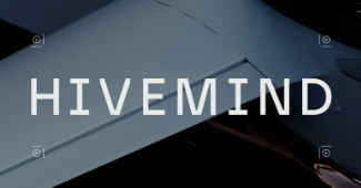
HIVEMIND wordmark reference
HIVEMINDWordmark
Abstract n logomark reference
Abstract nLogomark
Synapse combination reference
SynapseCombination
Aterko combination reference
AterkoCombination
Enclave combination reference
EnclaveCombination
CURV wordmark reference
CURVWordmark
Nethra wordmark reference
NethraWordmark
Modular logomark reference
ModularLogomark
Abstract mark reference
AbstractLogomark

02 · Colour

Colour system.
Cyber Industrial.

The recommended palette is near-black, off-white, and one acid accent. Acid is reserved for actions, badges, focus, and logo details — never body text.

Ink#101211Primary text · dark surface
Paper#E8E9E4Default background
Surface#F4F5F1Cards · inputs
Slate#555D56Metadata · borders
Acid#A6FF4DCTA · badge · focus
65 Paper / Surface 20 Ink / Graphite 10 Slate / Line 4 Acid 1 Semantic
Acid on Ink15.25:1 — safe for buttons and badges.
Ink on Paper15.41:1 — safe for all text.
Acid on Paper1.01:1 — decoration only, never text.

Status: recommended for sign-off. Palette B and C remain alternatives, not part of the core system.

02 · Scale & contrast

One accent,
many tones.

The 10–100 scale is used for hover, badge tints, borders, and illustration. BASE sits at 50%; tints move toward Paper, shades toward Ink.

Acid / 10 → 100Base 50%
Ink / 10 → 100Base 50%
15.41Ink on Paper · all textAA / AAA
15.25Acid on Ink · buttons & badgesAA / AAA
5.58Slate on Paper · body & captionAA

03 · Typography

Oxanium +
IBM Plex Sans.

Oxanium gives headlines an industrial, technical voice. IBM Plex Sans keeps product specs, prices, and checkout copy clear.

Aa
Oxanium / DisplayIBM Plex Sans / Body
Oxanium 700 · Display
Not your
usual store.
Oxanium 600 · H3
Desk Module 01
IBM Plex Sans 400 · Body

One knob, three functions, no screen. Aluminium case, clickable encoder, and a replaceable USB-C cable.

Status: recommended for sign-off. Two families only; no third decorative face.

03 · Type scale

Type scale.

Use this scale for headlines, product names, body, prices, and labels. Do not introduce sizes outside the system.

Display XLNot your usual store.Oxanium 700 · 72/48
H1Curated gadget collection.Oxanium 700 · 56/40
H2Curation, not a catalogue.Oxanium 600 · 40/30
H3Desk Module 01Oxanium 600 · 28/22
BodyClear specs, no jargon. Built for a small desk.IBM Plex Sans 400 · 16
UIAdd to cartIBM Plex Sans 500 · 14
CaptionLow stock · restock next weekIBM Plex Sans 500 · 12
OverlineSpec sheetIBM Plex Sans 600 · 11

Body max 68 characters per line. Prices and specs use tabular-nums. No more than three headline sizes per screen.

03 · Type in use

The system in use.

New Modular mark product visual

Desk Module 01

Encoder · USB-C · Aluminium

IDR 1,240,000

Add to cart

A quick application test: product name in Oxanium, specs and price in IBM Plex Sans with tabular numerals, Acid reserved for the badge and focus states.

  • 01Product names and headlines use Oxanium; never use it for long paragraphs.
  • 02Prices, stock, and specs use IBM Plex Sans with tabular numerals.
  • 03Acid is limited to badges, CTAs, and focus — not whole-page backgrounds.
  • 04The modular mark works as a product visual and app icon, not as a repeated pattern.

Preview only · not a final mockup

04 · Next steps

What happens
after this review.

01

Decide

Pick one logo route: 01 ODDWARE, 02 MODULR, or 03 Modular mark.

02

Refine

Final vector, construction grid, clear space, and app icon for the selected direction.

03

Apply

Storefront, packaging, and social mockups built with the chosen logo, colour, and type.

Not your usual gadget store.

Thank you ODDWARE · Progress review · November 2026